The Evolution of the Twitter Logo Will Blow Your Mind!

While it is true that the microblogging platform Twitter has been the talk of the town for some time now, there is one thing that most people forget: Twitter logo evolution!
Twitter is one of the biggest social media platforms. Furthermore, it has become one of the most important places to get live updates on various events and happenings. If a leader or a CEO makes a statement on Twitter, it becomes big news the next day.
Throughout the years, Twitter has seen massive changes, one of which is the Twitter logo.
In this article, you will learn how the Twitter bird has become one of the most significant iconic symbols. Additionally, you will learn about the new Twitter logo and Twitter logo evolution.
However, before that, you will learn some essential details about the history of the Twitter logo change. Hence, to fully understand the significance of the Twitter bird icons, read through to the end of the article.
A Brief Idea About Twitter (If You Still Don’t Know its Importance)
Twitter is a central social media platform where leaders, people in business, and ordinary people worldwide share their opinions through their accounts.
Even in some cases, Twitter also played the role of a political battlefield. It plays a huge role in elections throughout the world. Twitter’s effect in the 2016 and the 2020 Presidential elections.
Due to the large number of Twitter users worldwide, it has become a vast social media platform with an enormous effect.
Within the last year, Twitter has seen a lot of changes, including a new owner, reshuffling of employees, and various political effects throughout the world, especially in the United States.
Currently, the owner of Twitter is Elon Musk, who bought the platform for a whopping $44 billion, and the deal went on till27 October 2022.
A Few Interesting Facts You Need to Know About the Twitter Logo
When the platform started in 2005, its icon consisted of a green-colored icon, which then changed to a baby blue color, as you can see till now.
The Twitter bird, a famous icon, is popular among users as the “Larry Bird.” Developers were first introduced to the platform in 2010.
Unlike the newest Twitter icon, the bird was different in 2010 and would later go through various changes from time to time.
The creators of the icon made it with various things in mind as they wanted to make a psychologically pleasing effect on the onlooker’s mind. Hence, the Logo designer of Twitter created this with a particular design principle and a golden ratio.
Today, the Twitter logo has become iconic. However, this was not the situation before, as users could not recognize it immediately in its early years.
After they had almost perfectly designed the logo, it found its way to perfection and recognition as it evolved.
The Evolution of the Twitter Logo
Here is a description of how the Twitter logo evolved throughout the years, just like the Facebook logo, and became completely different from what was first thought of by the creators of the platform:
The First Logo: 2005-2006
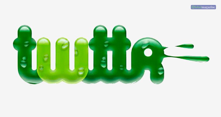
According to Logo.com,
“The original Twitter logo was never actually used on a public product! This logo was only used as the program was being developed and designed. Originally, the logo used a dark and light green color scheme, with drops of dew covering it.”
Actually, the creators of Twitter designed the logo in such a way as to represent freedom and nature. That is why they tried to keep the green color.
However, they decided to change the logo later. Additionally, they kept the attributes and ideals behind the logo intact.
The Entry Of The Blue: 2006-2010
After the launch of the Twitter platform in 2006, creator Linda Gavin designed the official logo of Twitter in blue.
It took just a day to create the Twitter logo. However, the logo has capitals, and the designer uses the font thoroughly in small letters.
Even today, the Twitter icon makes use of similar text and similar colors to represent the brand name.
The logo designer of Twitter kept it simple to represent the company’s simplicity as well. For the logo, as per the claims of Logo.com,”they completely changed the color palette, moving from green to a light aquamarine. A common color within the social media sector, blue is associated with trust, calmness, and integrity.”
The Bird Got Introduced: 2010 To 2012
The bird you see today with Twitter is from 2010. The company introduced it in 2010, in addition to the “Twitter” icon in written form.
The name of the bird that you have seen on the logo for a long time is Larry. The company named the bird in the logo after Larry Bird, a famous basketball player in the USA.
Designer Simon Oxley redesigned the logo. As per sources, initially, the logo consisted of a cartoon mascot with eyebrows, eyes, and paws.
However, the simple bird image soon replaced the mascot. The company decided to keep it as minimalist as possible.
The Iconic Blue Bird: 2012-2023
LThe designer first introduced the Twitter logo in 2012, when the company removed the name “Twitter” from the logo. They wanted to keep only the bird to represent the brand.
According to Logo.com,
“First, the color was slightly altered to a darker shade, close to true blue. This was done so that the logo would stand out better on the white background of a webpage! Additionally, the fluff on the top of the head and the top feather were removed to simplify the new Twitter logo.”
Furthermore, the company also decided to change the bird’s name from Larry Bird to “Twitter Bird.” As per inside sources, the bird represents accessible communication and unlimited freedom.
From Bird to X: 2023 – Present
When Elon Musk bought Twitter in 2023, we were all speculating if there were any changes he would bring to the social media platform. And when he did, we were clearly not ready for it!
In 2023, Twitter underwent a significant transformation, and its logo evolved to reflect this change. Musk announced they were replacing the iconic bird logo with a simple, bold letter “X.”
This new logo represents Twitter’s expansion beyond just tweeting to a platform encompassing a wide range of features and services.
The “X” logo symbolizes the unknown, the variable, and the limitless possibilities that Twitter aims to offer its users.
It’s a nod to the platform’s commitment to innovation and its desire to break free from the constraints of its past. With this new logo, Twitter is signaling its intention to move beyond its roots and become something more.
Summing Up
Love it or hate it, the new Twitter logo is a bold statement that marks the beginning of an exciting new chapter for the platform.
I hope that this article was helpful for you in giving you a better idea of the significance of the Twitter logo and how the its evolution to become one of the most identifiable icons in recent years.
Although Twitter’s logo represents freedom and communication, it was only partially the case with the platform, as, in many cases, the company had to change its policies to various political factors.
What do you like the best about Twitter’s logo? Please share your thoughts with us in the comments box below.
Read More:


