Amazon Logo, a Fascinating Journey of Evolution: It Has Some Secret Knowledge for You

There is much more to the Amazon logo than what looks to the eye. That is, the Amazon logo’s meaning has more to it than it seems. The Amazon logo is one of the most popular and eye-catching logos ever.
This is rightly so since Amazon is one of the biggest and most popular brands in the world at the moment. It is the biggest retail giant and rightly made its place as a brand having the most influence on online shopping.
In this article, you will learn about the way in which the Amazon logo conveys a positive experience to its customers.
Apart from that, you will also learn the brief history of the Amazon.com logo and how Amazon’s first logo evolved to be what you see with the current Amazon’s new logo. Hence, to learn more, read on through to the end of the article.
A Brief History Of Amazon Logo
Amazon was founded in Seattle in 1994 by the name Cadabra. However, within a few times, the name was changed since it sounded similar to a cadaver, a corpse.
The name was changed to Amazon since the owner, Jeff Bezos, wanted to come up with a word that would come up on top of the alphabetical list. Furthermore, the name also emphasized the size of the library, as the Amazon River is the biggest.

At first, the company only sold books online, but with time, it grew quickly with its amazing business model and made a lot of profits. These profits they invested back into the business. Such factors made the company grow within a short span of time.
Currently, the company is the biggest eCommerce platform and online marketplace. Apart from that, the company also comes with its own media platform, web platform, and tech equipment.
Amazon Logo Meaning – Conveying A Positive Message
When it comes to the number of services, Amazon offers more than 175 services, from eCommerce items, groceries, video streaming, luxury furniture brands, media, delivery, games, web hosting, IoT devices, and a lot more. Hence, the company wanted to name “Amazon,” which means massive and signifies massiveness. This is what the company wants to portray.

Furthermore, there is a smile below the word “Amazon,” which also looks like an arrow going from A to Z. So, what does the M in smiles stand for, Amazon? This signifies that everything (a to z) is available on Amazon. The smile also represents how the company strives to put a smile on the face of the customers. They also focus a lot on enhancing the experiences of the customers.
According to AboutAmazon.com,
“Amazon is guided by four principles: customer obsession rather than competitor focus, passion for invention, commitment to operational excellence, and long-term thinking. Amazon strives to be Earth’s most customer-centric company, Earth’s best employer, and Earth’s safest place to work.”
Amazon Logo Evolution

Just like the Facebook logo, the Amazon logo also evolved through the years. So, let’s look at the evolution of the Amazon logo.
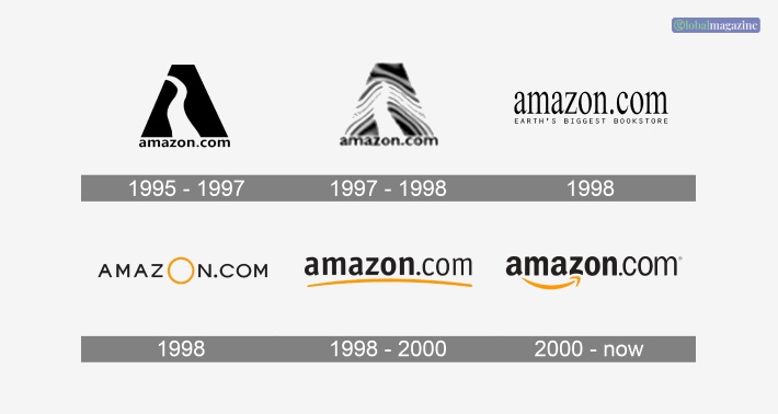
1. 1995-1998
The first logo or say original Amazon logo came in 1995 when Jeff Bezos created a logo per his vision. He made a logo that looked like a trapezoid and represented a river inside the logo.
The trapezoid looked like the letter ‘A.’ The river represented the Amazon or a forest path through the trapezoid. Under the trapezoid, the website’s name was “amazon.com.”
2. 1998-2000
Since the Amazon old logo seemed to be poorly executed and not catchy enough, the owner of the company decided to hire a designer for the logo, and two more logos were created.
The first logo simply consisted of “amazon.com,” written simply, and under it was “Earth’s Biggest Bookstore,” all in uppercase letters.
The second logo was created where the website name was written all in uppercase, like “AMAZON.COM,” and the ‘O’ was enlarged in the logo.
Another logo was created by Amazon, which resembled the current Amazon live logo. However, in the place of the smile, there was a yellowish-orange curved underline at the bottom of the logo.
3. 2000 – Present
The present Amazon logo, as you can see today, was introduced in the year 2000 and came with a yellow curve at the bottom of the logo that represented a smile. According to 1000logos.net,
“The colour constraint between the orange smiley arrow symbol and the black logotype is also a part of the concept — like dividing the professional side of the business from its entertaining and consuming one.”
The arrow from A to Z in the logo represents the diversity of the products and services that the company offers you.
The logo represents that you will find everything on this website, along with a smile on your face. This logo was designed by the Turner Duckworth Agency.
Furthermore, to save costs and to create a brand image, the company decided to make use of the smile of the logo as brand visuals on the boxes inside which the company delivered products.
Hence, they started to name these boxes as “smile boxes.” With the help of these, it also acted as a marketing option for the company, as they used the slogan, “Deliver smiles to your door.”
Finally, the logo’s smile became one of the most important elements for the brand, as it got to be recognized as the logo itself.
This can be regarded as a great example of logo versatility. The Amazon Prime logo, the Amazon Music logo, and all other logos use this smile.
This logo was the same in the app as well, as the logo consisted of the letter “a” along with the smile.
However, in 2021, the logo was changed. With the Amazon app logo change, the new logo represented a box with a smile and a box tape at the top of the box.
Font Style Of Amazon’s Logo
The Amazon logo’s font style is designed using Officina Sans Bold Interface.
The interface was specially designed for the band, and it was based on fonts similar to those of the PF Das Grotesk Pro Bold and Grotesco Bod. This is what makes the logo unique in itself.
Amazon’s Logo Color
The selection of colour is without question one of the inalienable to the logo design.
At the same time, it is one of the determiners of success.
They were seeking a colour that would represent friendliness reliability and speed.
Black, yellow, or orange in their logo definitely created a sense of amicability, which is a bridge between the buyer and the seller.
Final Thoughts
In this article, you learned the meaning behind the Amazon Prime logo and how it conveys a positive message to its target customers.
Hope this article also helped you in learning the evolution of the Amazon logo and how the logo is different from the first logo of the brand.
You can see from the article how the smile in the Amazon logo plays a significant role in brand promotion and marketing.
What do you like the best about Amazon? Share your reviews of the company in the comments below.
Read More:


