How The Roblox Logo Became Synonymous With Gaming?

The Roblox logo is easily recognizable, as Roblox is one of the best game developers in the world. With the popularity of Roblox, gamers can now instantly recognize the Roblox symbol, no matter which part of the world they come from. So, where did the Roblox games logo come from in the first place? Let us know in this article about these details.
This article will include some of the most essential aspects of the Roblox logo and the Roblox logo evolution. Apart from that, we will also look at some of the features of the logo that make it stand out in the online environment. Hence, to learn more about the Roblox logo, read on through to the end of the article.
What Is Roblox?
Roblox is basically a gaming platform, with the help of which you will be able to design virtual worlds. The game provides you with built-in tools, the ability to earn money, and the option to play games that are created by others. The name itself is a merger of two words, namely, Robot and Blocks, like the OnlyFans logo, where two words are merged together.

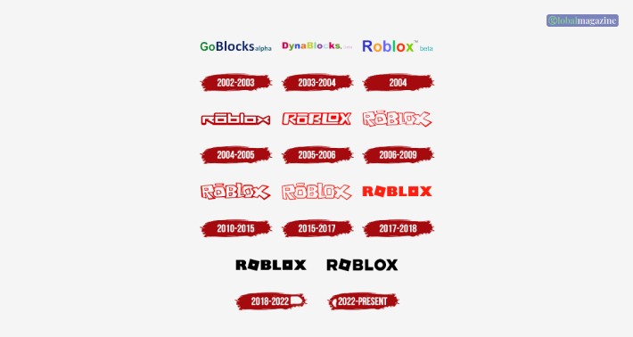
The history of the Roblox logo contains four different chapters. The company basically changed its name four times and the design of the logo multiple times to make itself associated with the gaming industry. The name Roblox itself was introduced in the year 2004, and since then, the internet has seen ten different designs of the logo.
Roblox Logo – A Brief History
To understand the history of the Roblox logo, you will need to get to the point where everything started. The original Roblox logo was designed in 2004 by the co-founders of the company, namely Erik Cassel and David Baszucki. The logo’s insignia came in ten different colors that showcased the funny and creative side of the logo. This helped a lot for Roblox branding in the first place, like the Facebook logo. This logo paved the way for the introduction of a series of amazing logos that are yet to come.

1. 1989- Present
Roblox, in its earlier days, was known as Interactive physics. This brand was the actual spiritual predecessor of Roblox. Hence, the old Roblox logo, that is, the logo of Interactive Physics, can be traced back to 1989. The organization kept this logo active till 2007. The word Interactive was kept in black, with a serif typeface, and the word Physics was in dark red and in cursive. Furthermore, the word Physics overlapped the lower part of the word Interactive.
2. 2003
The GoBlocksaplha logo was introduced in 2003 and consisted of a simple design, where the word Go was in green and the word Blocks in dark blue. Furthermore, the word Alpha was in another bluish-green hue and comprised of a shortened font in lowercase.
3. 2003-2004
A new multicolor logo appeared in 2003 yet again and was continued till 2004. This is because the platform was renamed to DynaBlocks, and the new “custom Roblox logo” was introduced with a sans-serif font, where each letter had different colors. Only the ‘y’ and the ‘s’ had a somewhat similar color. This was followed by a dot (.) in black, and the word ‘Beta’ is pink.
4. 2004
You must already know that the name Roblox was introduced in the year 2004. The coloring of the logo seemed to be inspired by Google. The Roblox logo was multicolor and had a shadow behind them, followed by the word “beta” in lower case and light-blue color. The font used in the logo was sans-serif, and it only managed to stay with the brand for a few months.
5. 2004-2005
The red Roblox logo was introduced towards the end of 2004, and the new logo looked futuristic and robotic and consisted of a strong design. The logo font was white, with red outlines. The first ‘o’ in the word ‘Roblox’ consists of a bar and the ‘x’ is composed of basically two arrowheads pointing towards each other like ‘><.’ The logo was really amazing and actually looked like a gaming logo.
6. 2005-2006
The letters of the logo were changed to uppercase, and the contours of the logo were softened. The logo looked a bit playful and consisted of a bluish tint.
7. 2006-2017
For twelve years, from 2005 to 2017, the Roblox logo remained more or less the same. The logo was made more cartoonish, with white fonts and red outlines. The logo produced a sense of playfulness and casualness. Each letter also slightly overlapped each other. This logo was later modified with thicker outlines and then again made thinner outlines as time went past.
8. 2017-2018
This time another version of the Roblox logo was created with the solid red inscription, where both the ‘O’ letters were in squares, and the first ‘O’ was titled right.
9. 2018-2022
This logo is the same as the last logo. Only now, the color is changed from red to fully black. The logo looked strengthened and simplified. The logo also looked quite welcoming and playful at the same time.
10. 2022-Present
The logo is yet redesigned, and the squarish look of the logo was changed and simply kept normal. However, the first ‘O’ if Roblox was kept square like before. The logo looks more minimalistic and cleaner than before.
Why Is Roblox Logo Gray?

Sometimes, it has been found that the Roblox logo comes in grey. One of the common questions among many people is that they want to know why the Roblox logo is grey in color or why is the Roblox logo silver. According to 1000logos.net,
“The silver-gray and black icon of Roblox represents the brand as a stable and confident one. The choice of calm and strict colors can be explained by the fact that Roblox is more focused on the quality and variety of its content, rather than on awareness and recognizability.”
Summing Up
Hope this article was helpful for you in getting a clear idea of the evolution of the Roblox logo. As you can see from the history of the logo how the, logo became synonymous with gaming, as it changed multiple times in its existence. Which of the Roblox logos do you think appeals to you the most? Share your opinions with us in the comments section below.
Read


