The Truth About the TikTok Logo Will SHOCK You!

TikTok is a central social media platform and has gained immense popularity worldwide due to its ability to run short videos known as reels. Furthermore, TikTok has become quite popular because its users love to spend time on it.
Additionally, TikTok allows creators to showcase their talents and create engaging content for people. However, one thing worth noticing about TikTok is the TikTok logo, which has significance behind it.
In this article, you will mainly learn about the significance and meaning of the TikTok logo. Moreover, you will also learn the aesthetic and branding strategy that made the TikTok logo famous.
However, before that, you will learn about TikTok’s history. Hence, to get fully informed about TikTok and its logo, read through to the end of the article.
TikTok: A Brief History of the Platform
TikTok is based in China, where it is popular as Douyin. You can access the platform as an app, developed per the concept of creating and sharing video content. The technology company ByteDance launched the app in 2016.
However, within two years, the company merged with another similar social media platform named Musical.ly. With the help of the merger, the app expanded to the rest of the world, especially in Europe and the USA.
Today, the TikTok logo is easily recognizable. You can check this article to learn how to see TikTok’s history, how to change TikTok’s appearance, and more.
The app is straightforward to use.

Once you sign up for the app using your email address and password, and after you complete a TikTok login, you will get access to a variety of content immediately.
If you follow a particular account, you will see more of the content from that account on your feed, just like any other social media platform.
On the other hand, if you want to grow your business through short videos, you can also do that with the help of TikTok.
Like other social media platforms like LinkedIn, Facebook, and Instagram, TikTok is also developing itself in such a way as to make sure that businesses grow on the platform as well.
With the help of TikTok and making short reels, companies also have the chance to stand out on social media.
The History Behind The TikTok Logo
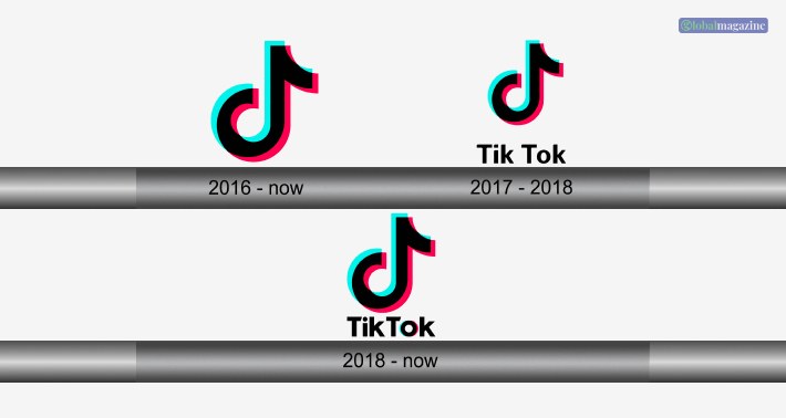
The TikTok logo that you see today was not there initially. However, until now, the design of the brand’s symbol has remained more or less the same.
Since its inception in 2016, the only difference you can see with TikTok’s symbol is that the words ‘Tik’ and ‘Tok’ were joined together as ‘TikTok,’ which was not the case before.
The app’s original name is Douyin, which is a Chinese name, and that name still knows the app in the country. However, the app is popular as TikTok across the world.

Though, with the rise in the number of users for the app, the app grew relatively fast. The significant surge in the number of signups happened in 2017, when TikTok’s mother company, ByteDance, bought Musical.ly and merged TikTok with it.
After integrating and merging the two social media platforms, developers shifted the existing users of TikTok to the new platform.
However, the designers made a fantastic logo that helped the users associate with the brand better.
TikTok Logo: Meaning, Significance, And More
Just like the Facebook logo, Twitter logo, and other logos of various social media sites, the TikTok logo is also unique and has significance to it as well.
The logo contains a symbol followed by the name TikTok. The emblem represents three things simultaneously – a musical note, the letter ‘d’, and the letter’ t.’

Here, the musical note stands for the entertainment produced through TikTok and Musical.ly. The Letter’ d’ stands for the Chinese app named Douyin. Furthermore, the letter ‘t’ stands for TikTok.
TikTok Logo Font
The right font for a logo is essential, as this will help enable a better association between users and the brand.
This also helps in drawing attention to the logo better. To come to the topic, the font used in the TikTok logo is Sans Serif, with a blocky typeface. This makes the wording easy to read and gives it a distinct design.
One of the exciting things you will see in the logo is a slightly slanted right side in the T’s in the word TikTok. This helps in getting the attention of a person quickly into the symbol.
TikTok Logo Color
The combination of colors in the TikTok logo is one of the most exciting things you will encounter.
The uniqueness of the TikTok logo depends on the unique combination of the colors in the logo.
The dominant color of the logo is black. The black TikTok logo is present over a white background.
However, the TikTok symbol and the letter ‘O’ in TikTok have a light aqua and a reddish pink accent on the background.
Developers create this as a design to mimic the 3D effect of the TikTok symbol. This also gives the idea of the colorfulness of the platform as the coming together of many creators.
According to LogoPoppin.com,
“The result is an understated logo design that keeps its simple smaller sizes, yet shows its true vibrancy on larger canvases. And it is this same ideology of small designs with massive impact that made the TikTok branding stand out and be successful in a social-media saturated ecosystem.”
Branding Strategy Behind the TikTok Logo
TikTok’s logo is a stylized letter “D” made up of two halves, one blue and one orange. The branding strategy behind this logo is rooted in the app’s purpose and values.
The two halves represent the dual nature of the app: creativity and entertainment. The blue half symbolizes trust, reliability, and professionalism, while the orange half represents energy, playfulness, and creativity.
Together, they form a balanced and harmonious whole, reflecting TikTok’s mission to bring people together through creative expression.
The logo’s simplicity and bold colors make it easily recognizable and memorable. The use of the letter “D” (for Douyin, TikTok’s Chinese name) pays homage to the app’s origins while also creating a unique and distinctive mark.
Overall, TikTok’s logo effectively communicates the app’s values and personality, making it an integral part of its brand identity.
Summing Up
I hope this article was helpful for you in understanding the meaning and significance behind the TikTok logo.
You can see from the article that the logo is quite unique and truly represents the brand and what it stands for.
What do you like the best about TikTok’s logo? Please share your opinion with us in the comments section below.
Read More:


